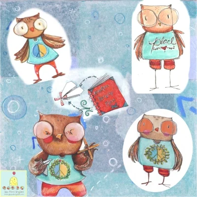
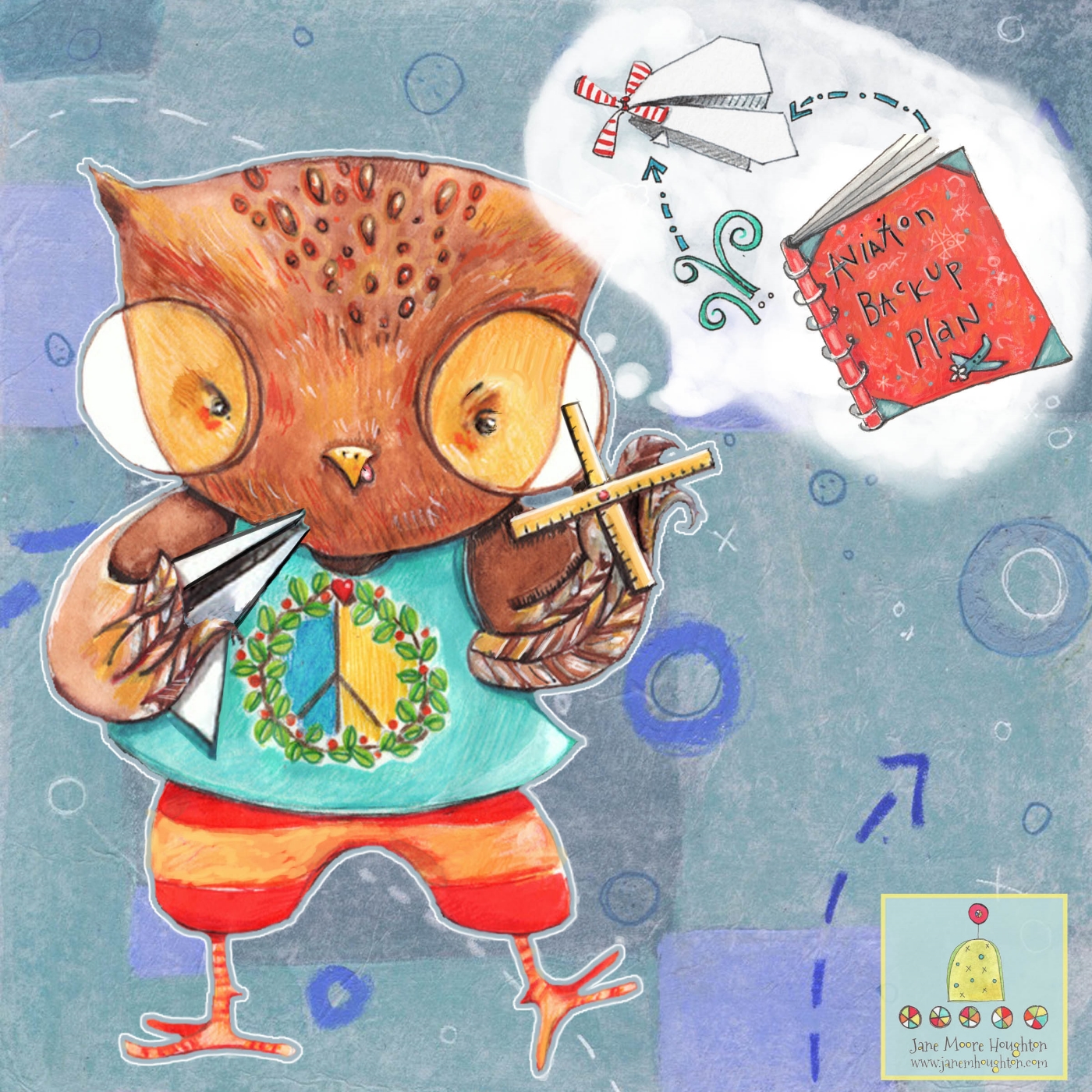
I've started a second concept for my Owl character and he has a name now: Parker (in honor of my son who this character is inspired by) 

He will be holding a kite and be placed in the scene below...

He will be holding a kite and be placed in the scene below...

background for Parker Owl on bike 

background for Parker Owl on bike 

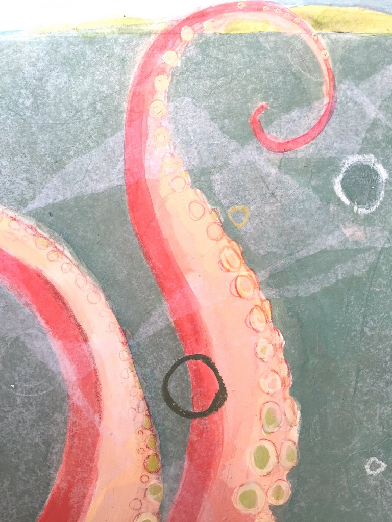
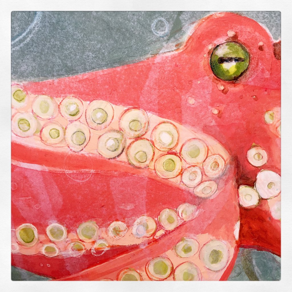
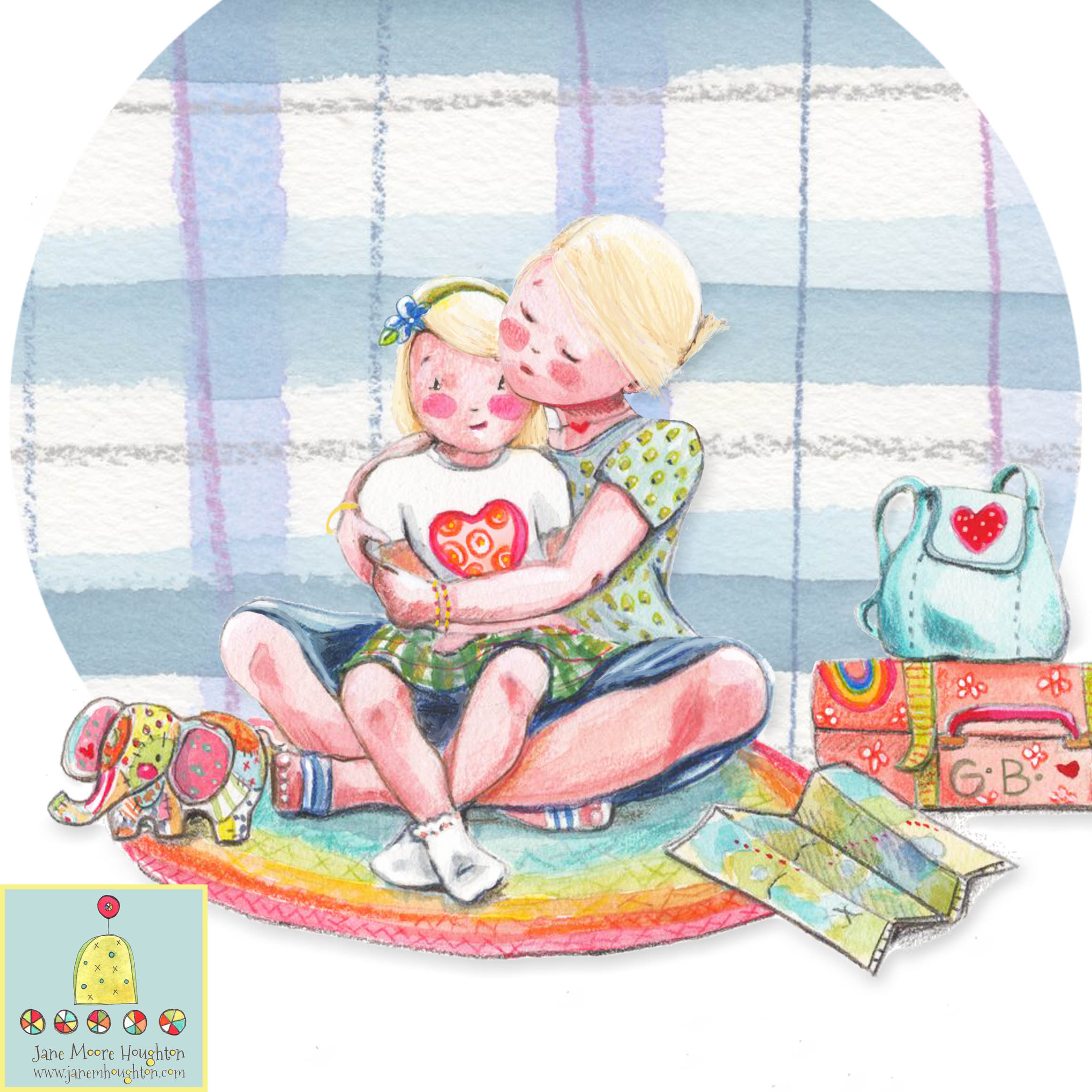
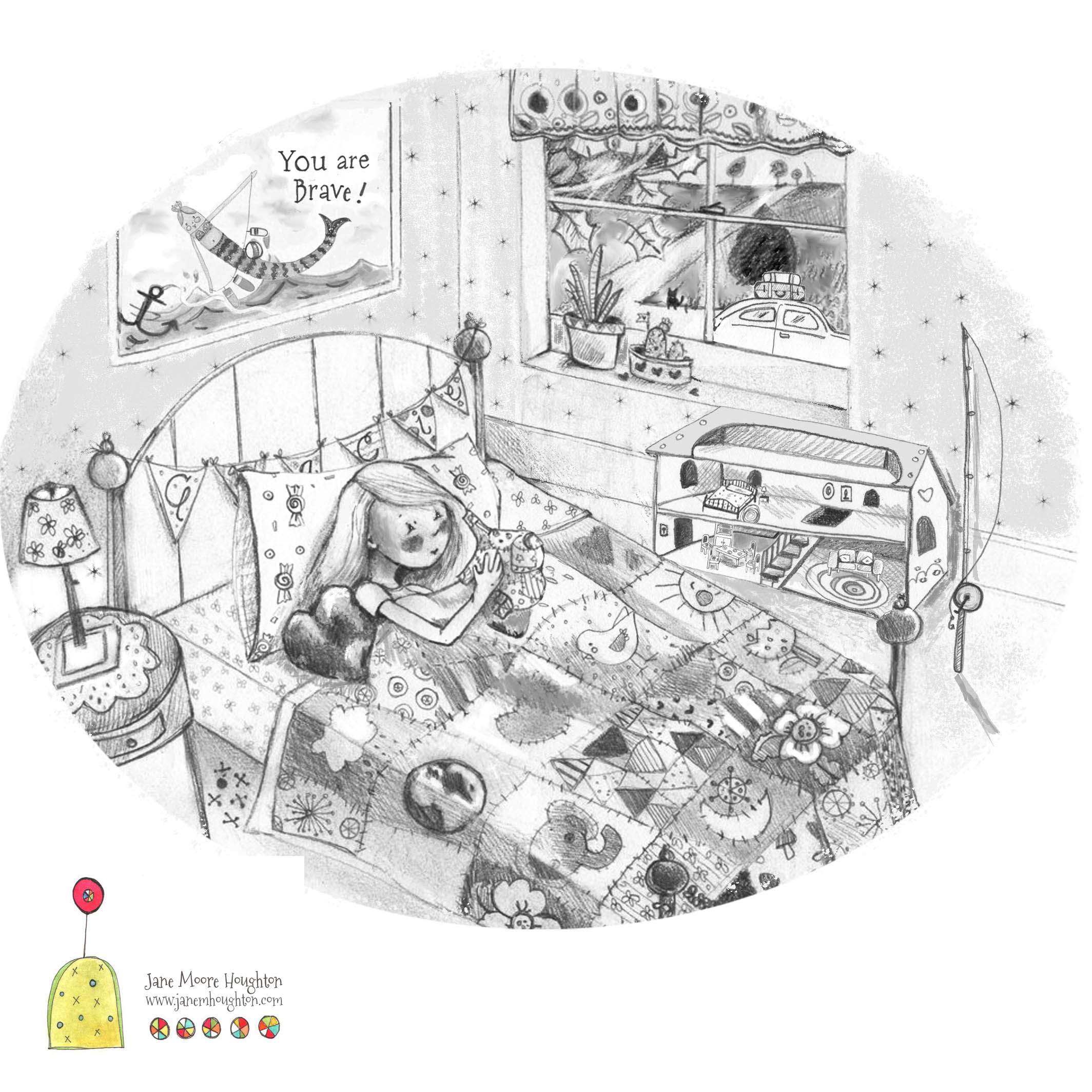
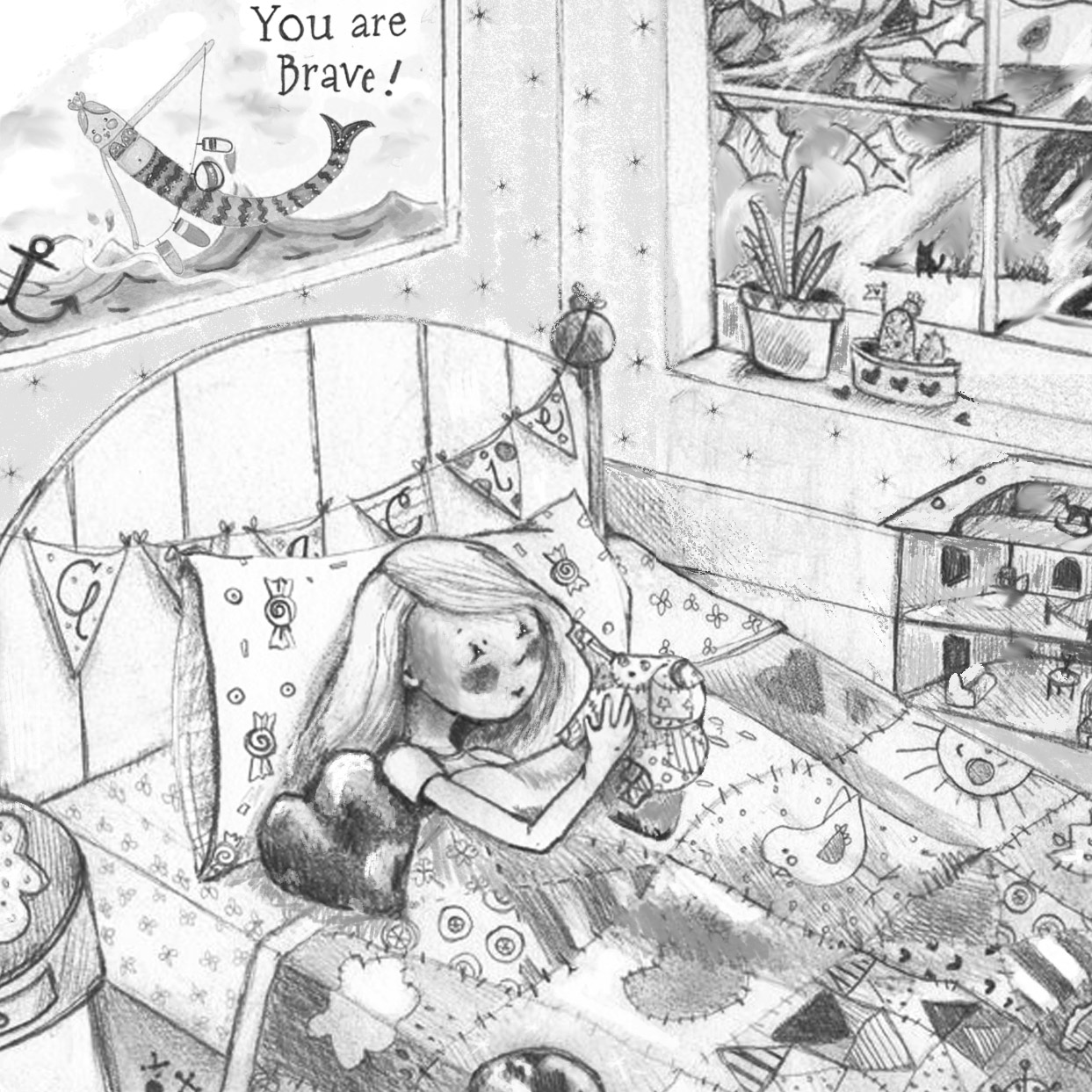
The Gracie Brave project is gaining momentum as well! We have been brainstorming about the final 1/3 of the book. It's been such an interesting process for me as I am integral in the problem solving not only for the illustrations but also the budget considerations and flow of the story in general. Normally I would be told, "do this illustration", period. I feel much more integrated into the production of this project and it's been a great experience! 

pigeon studies

pigeon studies


This is how I present the thumbnails and corresponding texts to the authors to help them see my vision: 


Tweaking

So, if you remember my post from last week, I am crafting a character loosely based on my son, Parker. This character is a crafty, out-of-the-box thinker who loves to learn all kinds of things. He gets so excited about the current thing he is interested in that everything else he's "supposed" to be doing gets ignored. I have been sketching and tweaking and even trying new materials to get just the right look for this guy. Here is where I started: 

The concept started with loose sketches that I did while listening to my son and his friends perform at an open mic night at his school. 

The concept started with loose sketches that I did while listening to my son and his friends perform at an open mic night at his school. 

I drew up four options in color; some looser than others. I tried painting directly on vellum, an idea I heard from Jake Parker on the Stories Unbound podcast. It gives a smoother result and a cleaner "cut" on Photoshop. 

I drew up four options in color; some looser than others. I tried painting directly on vellum, an idea I heard from Jake Parker on the Stories Unbound podcast. It gives a smoother result and a cleaner "cut" on Photoshop. 

My challenge at this point was to gather the aspects I liked from the above versions while maintaining a grounded, confident style. I've been thinking a lot lately about maintaining a "grounded" nature to my work. What do I mean by this? When I look at some illustrators or commercial artists who I admire; it's the confidence that shines through in their work that I strive to maintain in my own work, much more than the work itself. When I look back through my sketchbooks or pieces I have hanging in my studio, I can tell when I was in the moment with the attempts or when I was rushing for a particular job or if I was just not feeling it that day. It doesn't matter if I'm looking at work from today in a doodle I did while waiting on the phone or if I did it years ago: I can tell when I wasn't in the moment. My goal is to get more and more consistent with that grounded nature. Maybe every artist strives for this forever? 

This version was edited a bit - I made the paper airplane in his hand larger. I also made the propeller (made out of rulers) more prevalent in the composition. But, I still felt something was off. 

This version was edited a bit - I made the paper airplane in his hand larger. I also made the propeller (made out of rulers) more prevalent in the composition. But, I still felt something was off. 

On this latest version, I enlarged the eyes a bit to encourage a deeper connection to the character. I would welcome any feedback on how to make this image more powerful before I move on to another scenario for this guy who is still nameless. 

On this latest version, I enlarged the eyes a bit to encourage a deeper connection to the character. I would welcome any feedback on how to make this image more powerful before I move on to another scenario for this guy who is still nameless. 

Owlie Owlie Open Eyes!

I was honored this past weekend to be presented with a first place award for Creativity by the Princeton (MA) Arts Society 25th Anniversary Art Exhibit juror, Barry Van Dusen for my "Arapawa Goat" piece.

"A painting from another planet! Organic forms that re both familiar ad strange at the same time; soft harmonious palette; unexpected use of materials with needlepoint and quilted elements at the core." - Barry Van Dusen, Exhibit Juror and artist/illustrator 

"Arapawa Goat" 24" square  Acrylic, gouache, ink, graphite, tissue paper and hand embroidery on tissue paper. Available 

detail shot of the hand embroidery 

I've begun a new project that I am excited about. I am developing a new character I am referring to as "Owlie Owlie Open Eyes" because it reminds me of the game I used to play with my children when they were small. We would press our foreheads together and close our eyes. We would say, "Owlie owlie open eyes!" and ope our eyes. I miss those giggles and those curly-topped little people. This game doesn't go over so well with teenagers and newly crowned adults. 

I am basing him on my 17 year old smarty pants, out-of-the-box son. I am really looking forward to watching this character come to life! 

I am basing him on my 17 year old smarty pants, out-of-the-box son. I am really looking forward to watching this character come to life! 

Octopus - ready for delivery

I am photographing and sealing the Octopus piece today to get it ready for delivery early next week. I will be offering this piece as a print very soon! 

If you are local to Princeton, MA, I will be showing two of my pieces from my Beasts II series in the Princeton Arts Society Art Show and Sale this weekend at the Princeton Center Building. Stop by and enjoy art from local artists. 

Octopus

This week has afforded me time to get closer to the finish line with the large octopus commission I have been assigned. It's been a great break from the smaller, more detailed and concept-driven work of the Gracie Brave children's book illustrations of the last few months. 

I will put the final touches and details on in the next week and schedule delivery ! 

First layers: acrylic, colored pencil and vintage papers.

Second layer: gel medium, tissue paper and a layer of gel medium for pastels.

Third and final layers: gouache, ink, watercolor, colored pencil, pastel pencil, oil stick.