The authors of 'Gracie Brave' have made some tweaks to the manuscript and we are off and rolling again! The down time was necessary for their process and for me, I think, helped massage my creative spirit a bit! I am now in the depths of researching imagery for the next several pages which take place in San Francisco, a place I have visited but not for a very long time. Thank goodness for Google Image ! I also went to several local libraries to look at ways in which artists have chosen to render this beautiful city. There are so many fun images to interpret - it's hard to chose which ones to include and which ones lend themselves best to the story line.

thumbnail for two page spread: Gracie twirling in a park in San Francisco
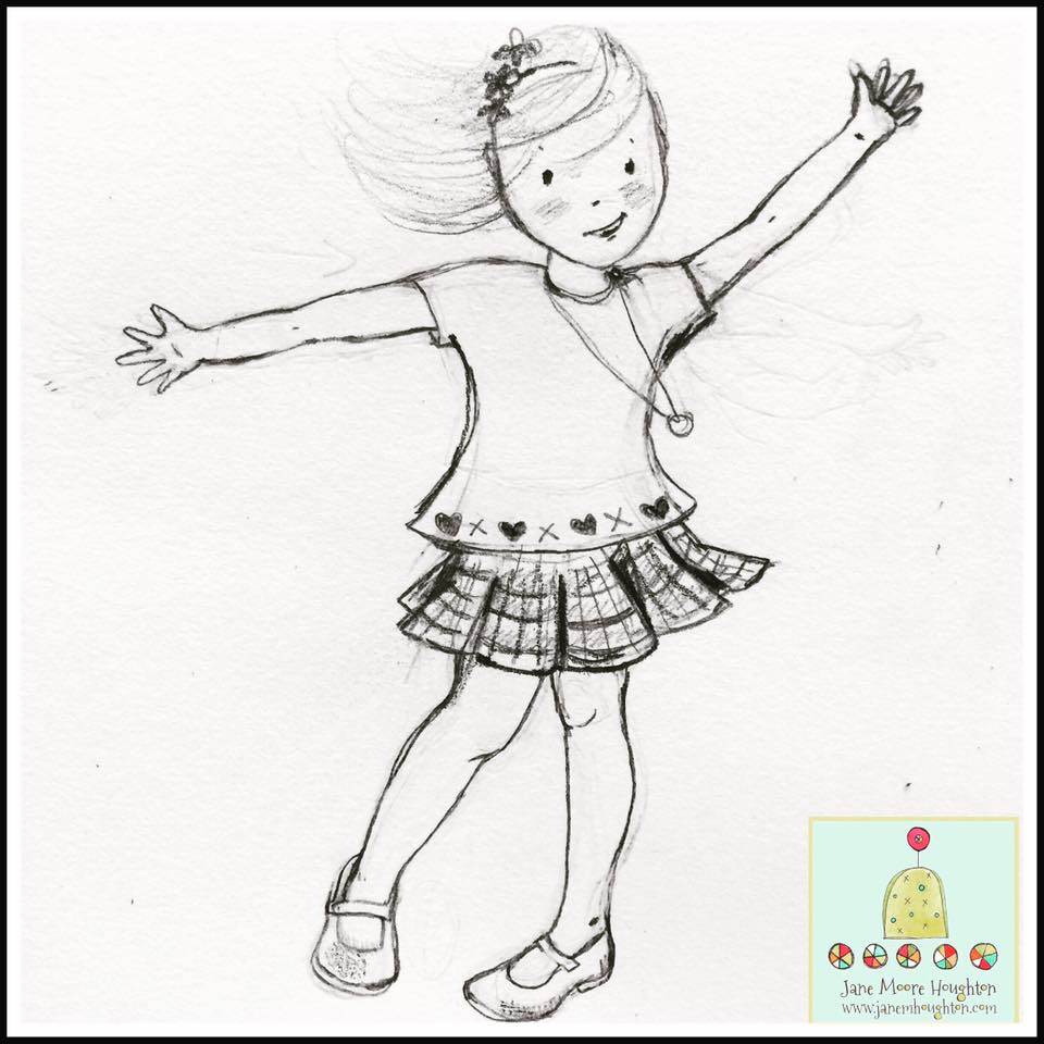
study sketch of Gracie twirling
I've been doing some tree studies to make the park environment magical - building to the climax in the story.
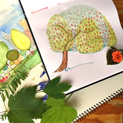

I really got into this willow tree
The process of creating this project is pretty unconventional but I am learning so much and loving the collaboration !